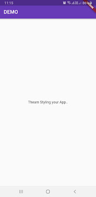
USING THEMES TO STYLE YOUR APP

USING THEMES TO STYLE YOUR APP The theme widgets are a great way to style and define global colors and font styles for your app. There are two ways to use theme widgets—to style the look and feel globally or to style just a portion of the app. For instance, you can use themes to style the color brightness (light text on a dark background or vice versa); the primary and accent colors; the canvas color; and the color of app bars, cards, dividers, selected and unselected options, buttons, hints, errors, text, icons, and so on. Using a Global App Theme When the project is created the default theme color of our application is blue and canvas color is White. To change the theme of your application we use the 'theme' property in material App that is your entry point of your GUI or Application. See the Below code to change the of your app: class MyApp extends StatelessWidget { // This widget is the root of your application. @override Widget build (BuildContext context) {...

